How to Choose Corporate Colors to Effectively Communicate Your Brand
 21 September, 2012

Corporate color schemes can be one of the essential statements a company can make. One of the key elements to building a strong brand is your color selection. It helps you to stand out from the competition and evokes emotions. Where would Tiffany & Company be if it did not have its unique “Tiffany Blue” color? Its color has been known worldwide as a symbol of style and sophistication. The color is also one of the most underestimated parts of the design for which its emphasis on light and dark provide value to a focal point.

Photo by Olivia Silver – Not bad for 5 years old
What you should think about when selecting your colors:
- Business Type – Choose a color that fits your business type. If your company sells organic products, you should probably go with a green color rather then blue or red. Look at your competition and try to choose something different and unique. Green is mostly associated with organic products for obvious reasons but perhaps a brown or yellow is better suited for you. As a point of reference, you should look into the psychology of color and see the latest color trends. People can sometimes get hung up when looking at these but try and keep things in perspective.
- Logo – The integration of color usually takes place during logo development. Design a logo that has an impact and choose colors that will help define your color palette. You don’t have to use every color in your color palette. One or two colors in your logo are OK.
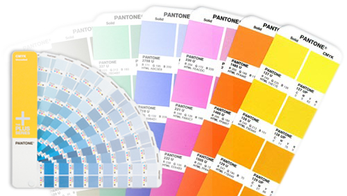
- Color Palette – When deciding on a corporate

Pantone CMYK Bookcolor, it is important to pick colors that can easily be complimented with other colors. Contrast is key for design. There are plenty of websites that can help you with your color. Below are a few tools you can use:
- Pantone – Is a staple resource you must use. I will not choose a color unless there is an equivalent pantone color for it.
- Paint manufacturers – Behr and Benjamin Moore are a great resource for ideas. I always look to them for inspiration. Color is what they do so do not be afraid to utilize them.
- 10 Super Useful tools for Choosing the Right Color Palette – This is a great reference article.
- Color Selection – The colors you choose must be able to be utilized in every type of medium. Consistency in your branding is key. You want those colors to look the same everywhere you use them. I always start with a pantone color that can be broken down easily for the web, CMYK and RGB. Pantone has a CMYK book that shows both the CMYK and Pantone colors side by side. Any Pantone colors that look different in CMYK will not be an option for me.
- Test your color selections – Comp (prototype) up every type of collateral, stationary, website or packaging necessary to ensure your decisions pan out.
- Create a corporate style guide – This tool will provide guideline–specifications for everything in your identity. Your core brand message and attributes are all carried out through every medium of your communications. This includes brand elements such as typography, color, photography, logos and other design elements. Download a sample of my color style guide.
The importance of color cannot be understated. Color is only one piece in the process toward the goal of developing your brand identification but it is the first thing I would review. If you follow these easy methods and pointers, you are certain to select the best colors for your brand.

Thank you so much. I appreciate you comments.